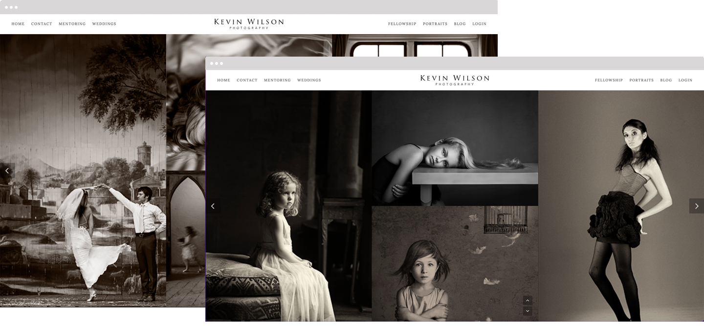
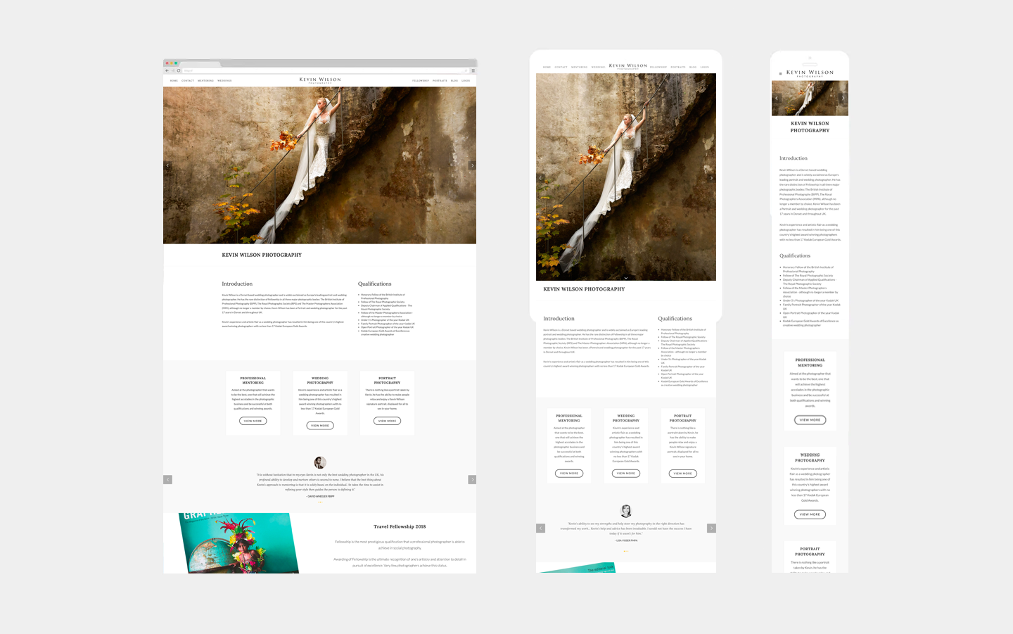
RESPONSIVE DESIGN AND BUILD
Overview
After outgrowing his previous website, Kevin needed a responsive and scalable website to showcase his award-winning photography, Fellowship awards and promote his mentoring programme.
REQUIREMENTS
Kevin approached me to take his website ‘up a level’, he wanted to have his existing site redesigned to be responsive and scalable. His business was transitioning from primarily wedding and portrait photography into mentoring photographers towards professional qualification. Kevin needed the website to promote his mentoring programme, featuring the mentees and their journey on their way through qualification into Fellowship and beyond. Kevin’s current site was not responsive, he also wanted the photographs to be much larger, with a ‘magazine’ feel. “It’s all about the images”, said Kevin describing his vision.
1 Photography portfolio showcase, awards and accreditations
2Fully responsive, must be able to browse on mobile devices e.g. tablet and phones.
3 Add Mentoring and ensure expansion for an ever-growing panel of mentees
4Showcase the Fellowship qualification images
PROCESS
We talked through some photographer’s websites, comparing them to his current site. Kevin wanted his site to reflect an editorial ‘glossy magazine’ feel. Aware that his customers were increasingly finding him using mobile devices, the site needed to display strong imagery, clearly on all size devices and to display the images quickly.
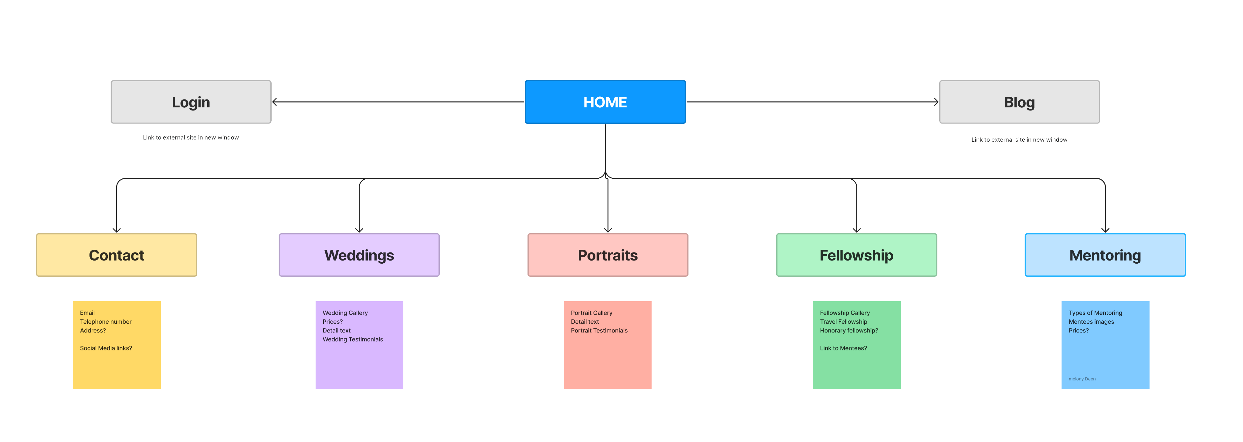
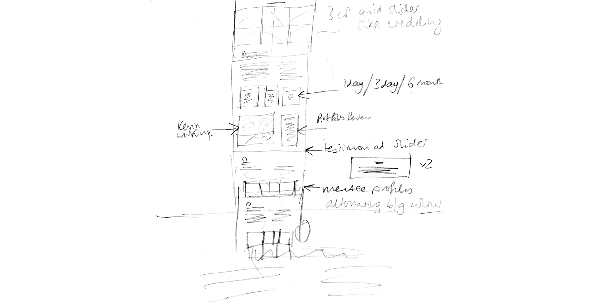
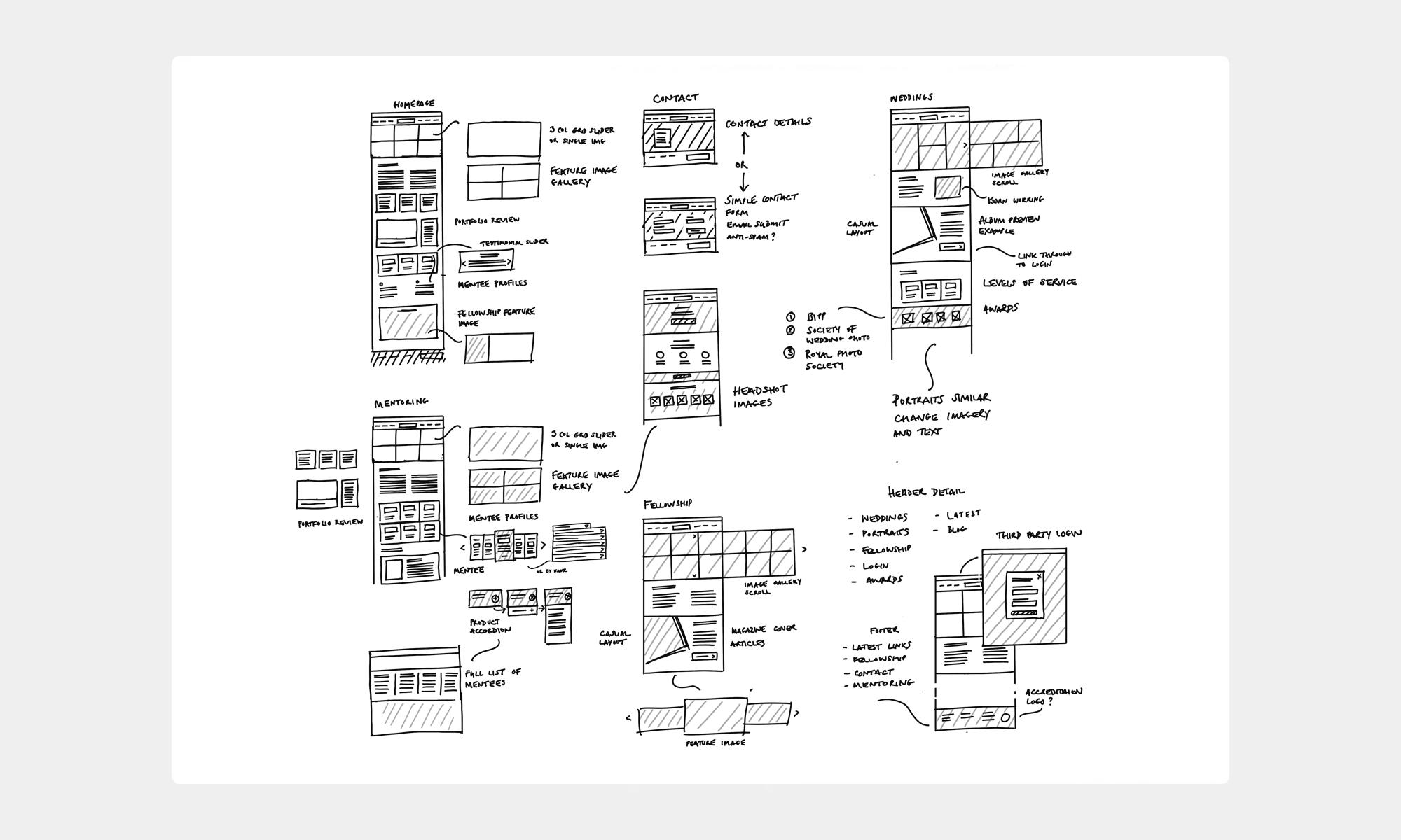
After a brainstorming session, I worked through some initial ideation sketches. A simple site map helped work through content on each page and navigation throughout the site, I took these sketches and produced some hi-fidelity wireframes to gather some feedback from on the ‘look and feel’ of the site.
IT'S really ALL ABOUT THE IMAGES, the images are what matters.
Involvement
- Website design and prototyping
- Responsive custom site build (HTML/CSS)
- Integration of third-party CRM toolset
challenges
- Due to the many large images on each page, I was mindful to minimise delay in page load, so I integrated an image pre-load widget to reduce delay page load and prevent page drop-out.
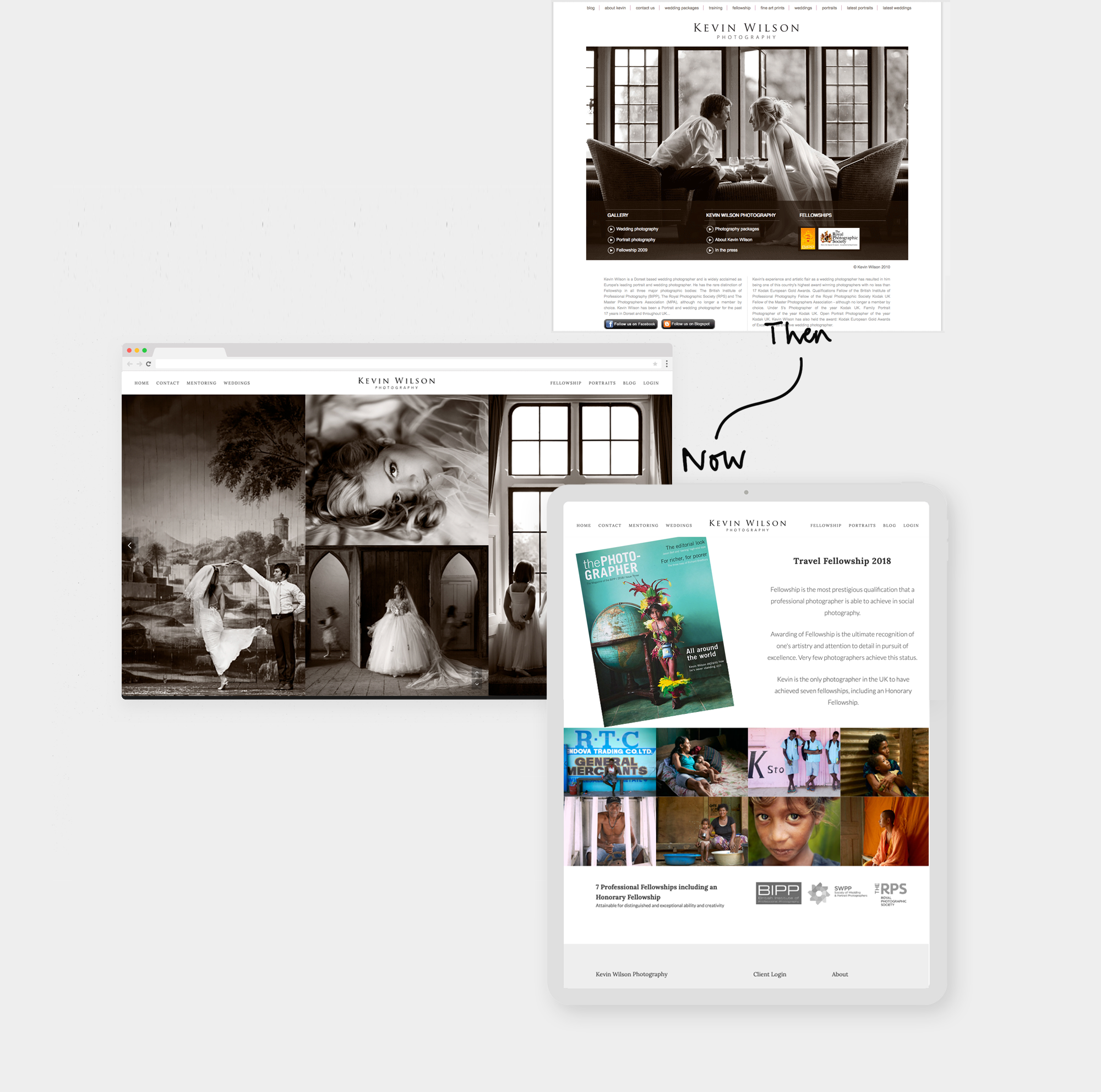
- I incorporated a large image gallery into the hero area, with horizontal and vertical image scrolling widget, maximising the amount of images to browse.
- The Travel Fellowship award needed more emphasis, I created a feature area to ensure the images and press article were prominent.
- Mentoring and Fellowship particularly were growing and becoming long pages so I chose a ‘sticky’ header throughout the site to ensure the navigation bar was visible at all times.
Outcome
I worked with Kevin to create a stunning, yet simple website featuring Kevin’s many award-winning images and his successful mentoring programme. Kevin was delighted with his new website, he is frequently complimented on its design and ease of use. The site has since expanded to his mentoring case studies and their portfolios. Kevin continues to win awards, his 2023 Fellowship is to be added soon.
